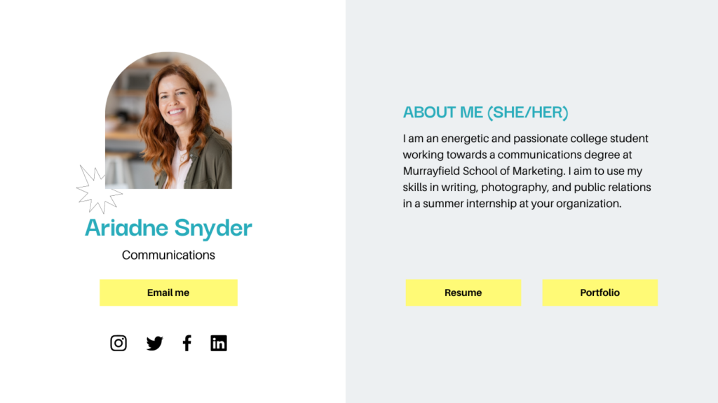
Your Shortlly.com card is your digital calling card. It’s the first impression you’ll make on potential clients, partners, and colleagues. So it’s important to make sure your card looks great.
In this blog post, we’ll give you five tips on how to design a killer Shortlly.com card. We’ll cover everything from choosing the right colors to adding the right fonts.
Tip 1: Choose the right colors
The colors you choose for your Shortlly.com card can make a big impact on the overall look and feel of your card. So it’s important to choose colors that are both professional and visually appealing.
A good rule of thumb is to choose two or three main colors for your card. You can then use these colors throughout your card, in the background, the text, and the icons.
Tip 2: Use a clear and concise font
The font you choose for your Shortlly.com card is also important. You want to choose a font that is easy to read and that matches the overall style of your card.
A good rule of thumb is to choose a sans-serif font. Sans-serif fonts are easy to read on screens, and they give your card a modern look.
Tip 3: Add a QR code
A QR code is a great way to make your Shortlly.com card more scannable. This will allow people to quickly access your contact information with their smartphone.
You can add a QR code to your Shortlly.com card by going to the “Settings” page and clicking on the “QR code” tab.
Tip 4: Keep it simple
When it comes to Shortlly.com card design, less is more. You don’t want to overload your card with too much information.
Stick to the essentials, such as your name, title, company, contact information, and social media profiles. You can also add a brief bio about yourself, but keep it short and sweet.
Tip 5: Promote your card
Once you’ve created your Shortlly.com card, you need to promote it. This means sharing it on social media, adding it to your website, and giving it to people in person.
You can also use Shortlly.com’s built-in sharing tools to make it easy for people to share your card with their contacts.
Conclusion
By following these tips, you can design a killer Shortlly.com card that will make a great impression and help you network with success.
Call to action
To learn more about Shortlly.com, visit their website or follow them on social media.
I hope this blog post has been helpful. If you have any questions, please feel free to leave a comment below.


